Advanced ORB IndicatorAdvanced ORB (Opening Range Breakout) Indicator
Overview
The Advanced ORB Indicator is a sophisticated trading tool designed to capture high-probability breakout opportunities across multiple markets. By identifying the opening range of a trading session and detecting meaningful breakouts, this indicator helps traders enter trending moves with strong momentum while filtering out false signals.
Core Concept
The Opening Range Breakout strategy is based on the principle that the initial trading range of a session often defines key support and resistance levels. When price breaks convincingly beyond this range with proper confirmation, it frequently indicates the beginning of a directional move that can persist throughout the session.
Key Features
### Intelligent Market Detection
- Automatically identifies market type (US Stocks, Forex, Crypto, EU/Asia Stocks)
- Applies optimal default timings based on market characteristics
- Configurable time zones (Exchange, UTC, Local) for precise session timing
Customizable Session Settings
- Adjustable opening range duration (15-240 minutes)
- Flexible reset periods (Daily, Weekly, Monthly, or Never)
- Custom session start times to match specific market opens or pre-market periods
Advanced Signal Filtering
- Multi-factor confirmation system requiring strong candle bodies, proper wick ratios, and minimum breakout percentages
- Smart cooldown periods preventing clustered signals
- Retracement detection that resets signals after meaningful pullbacks
Quality Control Mechanisms
- Volume threshold filter for stronger conviction entries
- RSI-based filters to avoid overbought/oversold conditions
- Trend alignment validation using EMA and directional analysis
- Consecutive candle confirmation for higher reliability
Visual Clarity
- Clear high/low boundary visualization
- Comprehensive status panel showing current levels, trend status, and filter conditions
- Clean, non-repainting signal triangles at breakout points
Trading Applications
Stocks & ETFs
Perfect for capturing morning momentum after market open, especially effective on US equities where the first 30-60 minutes often set the tone for the day. Excellent for gap fills, trend continuations, and reversal confirmations.
Forex & Futures
Ideal for session-based strategies around London/New York opens, capturing institutional order flow as major players enter the market. Can be configured for H4/H1 longer-term breakouts in 24-hour markets.
Cryptocurrency
Powerful for identifying key breakout levels in volatile crypto markets, with adjustable parameters to filter out noise while catching significant moves. Especially effective during high-volume periods following consolidation.
Strategic Implementation
The indicator excels when used as part of a complete trading system. Consider these approaches:
1. Pure Momentum Strategy: Enter on signal, exit at fixed R:R or end of session
2. Trend Continuation: Only take signals in the direction of the higher timeframe trend
3. Support/Resistance Validation: Combine with key S/R levels for higher probability entries
4. Volume Profile Confirmation: Use in conjunction with volume profile to verify breakout significance
Optimization Tips
- Adjust Opening Range Duration based on market volatility (shorter for choppy markets, longer for trending)
- Increase filter requirements during uncertain market conditions
- Loosen filters during strong trending environments
- Use longer durations (120+ minutes) for swing trading setups
- Consider Weekly/Monthly reset periods for positional trading approaches
Performance Notes
The Advanced ORB Indicator is designed to produce fewer, higher-quality signals rather than frequent low-conviction entries. The multiple confirmation requirements mean you'll catch fewer false breakouts at the expense of occasionally later entries.
For best results, combine with proper risk management, position sizing, and an understanding of the broader market context.
*This indicator works on all timeframes but performs optimally on 1-minute to 15-minute charts for intraday trading and 1-hour to 4-hour charts for swing trading opportunities.*
// @version=5
indicator("Advanced ORB Indicator", overlay=true)
// ===================================================================
// SIGNAL REQUIREMENTS DOCUMENTATION
// ===================================================================
//
// BULL SIGNAL REQUIREMENTS:
// - ORB period must be completed (not in the opening range duration anymore)
// - Price must close above the ORB high (if waitForClose is enabled)
// - Candle must have a strong body (body to range ratio >= minBodyToRangeRatio)
// - Valid upper wick (upper wick to body ratio <= wickThreshold)
// - Bullish candle (close > open)
// - Consecutive candle confirmation (if enabled, requires multiple candles meeting criteria)
// - Volume filter (if enabled, volume > average volume * threshold)
// - RSI filter (if enabled, RSI must not be overbought)
// - EMA filter (if enabled, price must be above short EMA)
// - Trend filter (if enabled, must be in an uptrend)
// - Cooldown period satisfied (minimum bars between signals)
// - Not already signaled a bull breakout for this ORB (unless reset by retracement)
//
// BEAR SIGNAL REQUIREMENTS:
// - ORB period must be completed (not in the opening range duration anymore)
// - Price must close below the ORB low (if waitForClose is enabled)
// - Candle must have a strong body (body to range ratio >= minBodyToRangeRatio)
// - Valid lower wick (lower wick to body ratio <= wickThreshold)
// - Bearish candle (close < open)
// - Consecutive candle confirmation (if enabled, requires multiple candles meeting criteria)
// - Volume filter (if enabled, volume > average volume * threshold)
// - RSI filter (if enabled, RSI must not be oversold)
// - EMA filter (if enabled, price must be below short EMA)
// - Trend filter (if enabled, must be in a downtrend)
// - Cooldown period satisfied (minimum bars between signals)
// - Not already signaled a bear breakout for this ORB (unless reset by retracement)
//
// SIGNAL RESET CONDITIONS (for both bull and bear):
// - A significant price retracement happens (determined by retracePercent)
// - Cooldown period expires (minimum bars between signals)
// ===================================================================
// ===================================================================
// SETTINGS GUIDE - DETAILED EXPLANATION
// ===================================================================
//
// MARKET SETTINGS
// ---------------------------------------------------------------------
// Market Type: Select your market or use auto-detection
// - US Stocks: NYSE, NASDAQ, etc. (9:30 AM default open)
// - Forex: Currency pairs (uses midnight or London open)
// - Crypto: Digital currencies (uses midnight UTC)
// - EU Stocks: European exchanges (9:00 AM default)
// - Asia Stocks: Asian exchanges (9:00 AM default)
// - Custom: Manually set your preferred session time
//
// Auto-Detect Market Type: Automatically identifies the market from symbol
// - Enable for convenience when switching between different markets
// - Disable to manually set your preferred market type
//
// Use Market Default Timing: Applies optimal session start times for selected market
// - Enable to use proven default timings for the market
// - Disable to set custom session start times
//
// Time Zone: Sets the reference time zone for session calculations
// - Exchange: Uses the exchange's native time zone (recommended)
// - UTC: Uses Coordinated Universal Time
// - Local: Uses your local computer's time zone
//
// TIME SETTINGS
// ---------------------------------------------------------------------
// Session Start Hour/Minute: Sets when the opening range begins
// - Only active when "Use Market Default Timing" is disabled
// - US Stocks typically use 9:30 AM
// - For pre-market analysis, try 4:00 AM (US) or 8:00 AM (EU)
//
// Opening Range Duration: How long to measure the initial range (minutes)
// - 30-60 mins: Standard for daily ORB strategies
// - 15 mins: More responsive, good for volatile markets
// - 120 mins: More stable, fewer false signals
//
// Reset Period: When to calculate a new opening range
// - Daily: Most common, resets each trading day
// - Weekly: Weekly opening range breakout strategy
// - Monthly: Long-term support/resistance levels
// - Never: Continuous tracking without resetting
//
// SIGNAL QUALITY SETTINGS
// ---------------------------------------------------------------------
// Minimum Bars Between Signals: Prevents clustering of multiple signals
// - Higher values (8-10): Fewer signals, better quality
// - Lower values (3-5): More signals, requires more filtering
//
// Required Retracement % Before New Signal: How far price must pull back
// - Higher values (50-60%): Only signals after significant pullbacks
// - Lower values (20-30%): More signals, may include false breakouts
//
// Minimum Breakout % Required: Strength needed for valid breakout
// - Higher values (0.5-1.0%): Stronger confirmation, fewer false breakouts
// - Lower values (0.1-0.3%): More sensitive, good for low-volatility
//
// Minimum Body to Range Ratio %: Requires strong candles for signals
// - Higher values (70-80%): Only strong momentum candles trigger signals
// - Lower values (40-50%): More signals, includes weaker breakouts
//
// BREAKOUT SETTINGS
// ---------------------------------------------------------------------
// Max Wick to Body Ratio: Controls acceptable candle shape
// - Lower values (0.2-0.3): Only clean breakout candles
// - Higher values (0.5-0.6): More signals, includes wicks
//
// Use Close Price: Uses close instead of High/Low for breakouts
// - Enable for more reliable but delayed confirmation
// - Disable for earlier signals using High/Low prices
//
// Wait for Candle Close: Only signals after candle completes
// - Enable to avoid false breakouts (recommended)
// - Disable for earlier entry but higher risk
//
// FILTER SETTINGS
// ---------------------------------------------------------------------
// Filter Signals Based on Trend: Aligns signals with the overall trend
// - Enable to filter out counter-trend signals (recommended)
// - Disable for range-bound markets or counter-trend strategies
//
// Trend Detection Period: Lookback period for trend calculation
// - Longer periods (50-100): Identifies major trends
// - Shorter periods (20-30): More responsive to recent price action
//
// Trend Strength Threshold: How strong trend must be
// - Higher values (0.7-0.8): Only strong trends generate signals
// - Lower values (0.5-0.6): More signals in choppy markets
//
// Use Volume Filter: Requires above-average volume for signals
// - Enable for stocks and futures (recommended)
// - May disable for some forex pairs with unreliable volume data
//
// Volume Threshold: How much above average volume is required
// - Higher values (2.0-3.0x): Only significant volume spikes
// - Lower values (1.2-1.5x): More signals, less volume confirmation
//
// Use RSI Filter: Prevents signals in overbought/oversold conditions
// - Enable to avoid exhausted moves
// - Disable for strong trend following
//
// Use EMA Alignment Filter: Ensures price is in the right direction
// - Enable for trend confirmation (recommended)
// - Disable for early reversal signals
//
// Require Consecutive Candle Confirmation: Needs multiple confirming candles
// - Enable for higher quality signals
// - Disable for faster but riskier entries
//
// DISPLAY SETTINGS
// ---------------------------------------------------------------------
// Show Label with Values: Displays current ORB levels and status
// Show Range Boundaries: Displays high/low lines on chart
// High/Low Boundary Color: Customize appearance
//
// ===================================================================
// RECOMMENDED SETTINGS BY MARKET TYPE
// ===================================================================
//
// US STOCKS - STANDARD
// ---------------------------------------------------------------------
// - Market Type: US Stocks
// - Opening Range Duration: 30 minutes
// - Reset Period: Daily
// - Wait for Candle Close: Enabled
// - Use Volume Filter: Enabled (Volume Threshold: 1.5-2.0x)
// - Use Trend Filter: Enabled
// - Minimum Breakout %: 0.3-0.5%
//
// US STOCKS - EARNINGS/HIGH VOLATILITY
// ---------------------------------------------------------------------
// - Opening Range Duration: 60 minutes (more stable)
// - Minimum Breakout %: 0.7-1.0% (stronger moves required)
// - Minimum Bars Between Signals: 8-10 (avoid whipsaws)
// - Required Retracement %: 40-50% (deeper pullbacks)
// - Volume Threshold: 2.5-3.0x (higher volume confirmation)
//
// CRYPTO
// ---------------------------------------------------------------------
// - Market Type: Crypto
// - Opening Range Duration: 120 minutes (crypto needs longer)
// - Reset Period: Daily
// - Minimum Breakout %: 1.0-1.5% (higher volatility needs stronger breakouts)
// - Volume Threshold: 2.0-2.5x
// - Consider disabling RSI Filter (trending crypto often stays overbought/oversold)
//
// FOREX - MAJOR PAIRS
// ---------------------------------------------------------------------
// - Market Type: Forex
// - Session Start: Consider 8:00 AM (London open) or 5:00 PM (Asian open)
// - Opening Range Duration: 60-120 minutes
// - Min Body to Range Ratio: 50-60% (forex can have smaller bodies)
// - Consider disabling Volume Filter (unreliable on some platforms)
// - Trend Strength Threshold: 0.6-0.7 (forex tends to trend well)
//
// EU STOCKS
// ---------------------------------------------------------------------
// - Market Type: EU Stocks
// - Opening Range Duration: 60 minutes
// - Reset Period: Daily
// - Use EMA Alignment: Enabled
// - Use Volume Filter: Enabled
//
// SMALL CAP/VOLATILE STOCKS
// ---------------------------------------------------------------------
// - Opening Range Duration: 15-30 minutes (captures early moves)
// - Minimum Breakout %: 1.0-2.0% (needs stronger breakouts)
// - Volume Threshold: 3.0x (needs significant volume)
// - Max Wick to Body Ratio: 0.3 (cleaner breakouts)
// - Use Consecutive Candle Confirmation: Enabled (2-3 candles)
//
// LOW VOLATILITY ENVIRONMENT
// ---------------------------------------------------------------------
// - Opening Range Duration: 30-60 minutes
// - Minimum Breakout %: 0.2-0.3% (lower threshold for tight ranges)
// - Required Retracement %: 20-30% (smaller pullbacks)
// - Consider disabling Consecutive Candle Confirmation
//
// HIGH VOLATILITY ENVIRONMENT
// ---------------------------------------------------------------------
// - Opening Range Duration: 60-120 minutes (more stable)
// - Minimum Breakout %: 0.8-1.5% (stronger confirmation)
// - Required Retracement %: 50-60% (deeper pullbacks)
// - Minimum Bars Between Signals: 8-10 (avoid choppy signals)
// - Use Consecutive Candle Confirmation: Enabled (2-3 candles)
// ===================================================================
在腳本中搜尋"volume profile"

Liquidity Sweep Filter [AlgoAlpha]Unlock a deeper understanding of market liquidity with the Liquidity Sweep Filter by AlgoAlpha. This indicator identifies liquidity sweeps, highlighting key price levels where large liquidations have occurred. By visualizing major and minor liquidation events, traders can better anticipate potential reversals and market structure shifts, making this an essential tool for those trading in volatile conditions.
Key Features :
🔍 Liquidity Sweep Detection – Identifies and highlights areas where liquidity has been swept, distinguishing between major and minor liquidation events.
📊 Volume Profile Integration – Displays a volume profile overlay, helping traders spot high-activity price zones where the market is likely to react.
📈 Trend-Based Filtering – Utilizes an adaptive trend detection algorithm to refine liquidity sweeps based on market direction, reducing noise.
🎨 Customizable Visualization – Modify colors, thresholds, and display settings to tailor the indicator to your trading style.
🔔 Alerts for Liquidity Sweeps & Trend Changes – Stay ahead of the market by receiving alerts when significant liquidity events or trend shifts occur.
How to Use:
🛠 Add the Indicator : Add the Liquidity Sweep Filter to your chart and configure the settings based on your preferred sensitivity. Adjust the major sweep threshold to filter out smaller moves.
📊 Analyze Liquidity Zones and trend direction : Look for liquidation levels where large buy or sell stops have been triggered. Major sweeps indicate strong reactions, while minor sweeps show gradual liquidity absorption. You can also see which levels are high in liquidity by the transparency of the levels.
🔔 Set-Up Alerts : Use the in-built alerts so you don't miss a trading opportunity
How It Works :
The Liquidity Sweep Filter detects liquidity events by tracking swing highs and lows (defined as a pivot where neighboring candles are lower/higher than it) where traders are likely to have placed stop-loss orders. It evaluates volume and price action, marking areas where liquidity has been absorbed by the market. Additionally, the integrated trend filter ensures that only relevant liquidity sweeps are highlighted based on market direction, lows in an uptrend and highs in a downtrend. The trend filter works by calculating a basis, and defining trend shifts when the closing price crosses over the upper or lower bands.The included volume profile further enhances analysis by displaying key trading zones where price may react.
Value Zones [Influxum]The volume of traded contracts at a specific price level is, in our opinion, one of the most critical components of any trading system. The area where price acceptance occurred, and the most contracts were traded, represents a very objective phenomenon on the chart, reducing the degree of discretionary trading. This is commonly referred to as POC – Point of Control – the point where the most units of an instrument were traded. Our Value Zones take this a step further by identifying additional local extremes, i.e., areas where significant trading volumes occurred locally at specific prices. This provides objective information about the points on the market where buyers and sellers agreed on a price, resulting in what is known as consolidation. This information can help identify the price levels or zones where aggressive buyer or seller behavior, and consequently a significant price reaction, might be expected. We do not perceive the POC or local extremes as mere price levels but rather as zones. The distribution of trades in the market is a stochastic process, and deviations can occur, which is why we extend local extremes and the POC with a coefficient reflecting the current session's volatility.
🟪 General Settings
Session
Value Zones are always calculated for a specific time period. In this section, you can set whether you want to see Value Zones for 30-minute candles, hourly charts, 4-hour charts, daily, weekly, or monthly timeframes. Keep in mind the timeframe you are currently viewing. If you attempt to display monthly Value Zones on minute candles, the chart will typically load only 10,000 to 20,000 candles, representing a maximum of 20 days, which is insufficient for accurately determining monthly Value Zones.
Levels of Detai l
To simplify working with Value Zones, you don’t need to manually set the size of a single row in the volume profile in terms of ticks. Simply choose how many rows the entire range of the selected session should be divided into. Local maxima will then be identified within the specified number of rows. The more rows you choose, the more detailed the Value Zones will be. However, this may lead to identifying local extremes too close to each other (in cases where consolidation has occurred for a longer period). We recommend an optimal setting of 50 to 100 rows to ensure the significant local extremes are effectively visualized.
Volume Type
An interesting metric is not just the volume traded at a price but also the ratio of buy and sell volumes – the delta. Based on the data available, this is not a precise tick-based or bid-ask delta but rather a delta derived from the volume of candles on lower timeframes. For daily sessions, for instance, we use minute candles. If a candle closes higher than it opens, it is considered positive delta. If it closes lower, it is negative delta. This helps identify whether buyers or sellers were more aggressive at a specific price level (not whether there were more buyers or sellers, as each trade always involves both sides).
🟪 Heatmap
A heatmap visualizes the volume profile, displaying volume on a given row through color intensity. For standard volume, the intensity represents a single color. For delta, separate colors are used to represent positive and negative delta intensity.
Align
Choose whether the Heatmap will always appear on the right or left side. If set to the right, historical Heatmaps will display at the start of the next session after the session concludes. A developing session’s Heatmap will appear on the right in real time. If set to the left, the Heatmap will always appear at the start of the session it represents. For a developing session, the Heatmap is also on the left. Note that right after the session begins, the Heatmap may look unusual because there isn’t yet enough price data to calculate all the rows (e.g., the 50 rows set in Levels of Detail).
Heatmap Length
This determines the Heatmap’s length in terms of the number of candles.
Color Settings
You can configure colors separately for Volume and Delta modes. The color settings for POC are shared for both modes.
🟪 Local Peaks
Draw Local Peaks
Here, you can set how local peaks (in addition to POC) will be displayed. If set to "None," neither POC nor any local extreme will be shown. You can choose to display POC and local peaks as lines, boxes, or both.
Number of Local Peaks
If set to 0 and a display mode for POC and local extremes (line, box, or both) is active, only the POC will be displayed. Any value higher than 0 will display that number of local extremes, as long as they are found. If the Level of Detail is set too low, no local extremes might be identified.
🟪 Visuals - Historical & Current
To tailor your chart to your preferences, you can freely customize the colors for local peaks and POC, lines and boxes, and even differentiate between historical and developing values. The choice is entirely yours!

Range Detect SystemTechnical analysis indicator designed to identify potential significant price ranges and the distribution of volume within those ranges. The system helps traders calculate POC and show volume history. Also detecting breakouts or potential reversals. System identifies ranges with a high probability of price consolidation and helps screen out extreme price moves or ranges that do not meet certain volatility thresholds.
⭕️ Key Features
Range Detection — identifies price ranges where consolidation is occurring.
Volume Profile Calculation — indicator calculates the Point of Control (POC) based on volume distribution within the identified range, enhancing the analysis of market structure.
Volume History — shows where the largest volume was traded from the center of the range. If the volume is greater in the upper part of the range, the color will be green. If the volume is greater in the lower part, the color will be red.
Range Filtering — Includes multi-level filtering options to avoid ranges that are too volatile or outside normal ranges.
Visual Customization — Shows graphical indicators for potential bullish or bearish crossovers at the upper and lower range boundaries. Users can choose the style and color of the lines, making it easier to visualize ranges and important levels on the chart.
Alerts — system will notify you when a range has been created and also when the price leaves the range.
⭕️ How it works
Extremes (Pivot Points) are taken as a basis, after confirming the relevance of the extremes we take the upper and lower extremes and form a range. We check if it does not violate a number of rules and filters, perform volume calculations, and only then is the range displayed.
Pivot points is a built-in feature that shows an extremum if it has not been updated N bars to the left and N bars to the right. Therefore, there is a delay depending on the bars specified to check, which allows for a more accurate range. This approach allows not to make unnecessary recalculations, which completely eliminates the possibility of redrawing or range changes.
⭕️ Settings
Left Bars and Right Bars — Allows you to define the point that is the highest among the specified number of bars to the left and right of this point.
Range Logic — Select from which point to draw the range. Maximums only, Minimums only or both.
Use Wick — Option to consider the wick of the candles when identifying Range.
Breakout Confirmation — The number of bars required to confirm a breakout, after which the range will close.
Minimum Range Length — Sets the minimum number of candles needed for a range to be considered valid.
Row Size — Number of levels to calculate POC. *Larger values increase the script load.
% Range Filter — Dont Show Range is than more N% of Average Range.
Multi Filter — Allows use of Bollinger Bands, ATR, SMA, or Highest-Lowest range channels for filtering ranges based on volatility.
Range Hit — Shows graphical labels when price hits the upper or lower boundaries of the range, signaling potential reversal or breakout points.
Range Start — Show points where Range was created.
Liquidity PeaksThe "Liquidity Peaks" indicator is a tool designed to identify significant supply and demand zones based on volumetric analysis. It analyzes the volume profile within a specified lookback range to pinpoint the most volumetric point and draw corresponding zones on the price chart.
The 𝐋𝐢𝐪. 𝐏𝐞𝐚𝐤𝐬 indicator utilizes volume data to identify key supply and demand areas on the price chart. By examining the volume profile within a defined lookback range, it highlights three distinct zones: liquidity grab, volume containment, and the most volumetric point.
Zones and their meanings:
Liquidity grab (Orange box): This zone represents a price level where there is a significant swipe of the previous demand zone within the volume range. It indicates a potential shift in market sentiment and serves as a key supply or demand area.
Volume containment (Gray box): This zone displays the area of volume contained before the peak in volume. It provides insights into the range where buying or selling pressure was concentrated, highlighting potential support or resistance levels.
Most volumetric point (Light blue box): This zone represents the point within the lookback range that exhibits the highest volume. It signifies a significant area of market interest and indicates a potential supply or demand level.
Adjustable options:
Adjust liquidity Grab: This option allows you to adjust the size of the boxes. When enabled, the box size is set to twice the size of the high or low of the candle's wick. This adjustment enhances the visibility and accuracy of identifying swipes at specific price levels.
Show origin: Enabling this option ensures that the liquidity boxes are drawn from the wick they were created from. This provides a clear visual reference to the specific candle and highlights the liquidity levels associated with it.
Utility:
The 𝐋𝐢𝐪. 𝐏𝐞𝐚𝐤𝐬 indicator is a valuable tool for traders and investors seeking to identify significant supply and demand zones in the market. By analyzing volume data and drawing corresponding zones on the chart, it helps to pinpoint areas where buying or selling pressure is likely to emerge.
Traders can utilize this information to identify potential support and resistance levels, plan their entries and exits, and make more informed trading decisions. The liquidity grab zones can act as potential reversal or breakout points, while the volume containment zones and most volumetric points provide insights into areas of high market interest.
It is important to note that this indicator should be used in conjunction with other technical analysis tools and indicators to confirm trading signals and validate market dynamics.
Example Charts:

Tick Profile HeatmapThis is a market internal TICK heatmap with the intent of displaying areas of price associated to stronger reactions with NYSE TICK (by default).
This code is based off of a variation of a Volume Profile coded originally by colejustice who originally used code from LuxAlgo . The full-width volume bars that colejustice setup were replaced with full-width bars representative of TICK breaking +/- $500, the current cumulative value representing the "heat" is comprised of hlc3 by default but that can be changed. In a future update I may add additional logic here to capture highs and lows in the heatmap specifically, and perhaps additional colors.
As with other traditional profiling studies, this indicators purpose is to visualize correspondence to specific price levels, allowing rapid assessment where the most TICK activity is occurring, and where it hasn't been. This information may provide areas of support and resistance and regions where price may move quickly repeatedly.
All of the same input guidance that colejustice provided is the same for those pre-existing inputs:
Inputs are set up such that you can customize the lookback period, number of rows, and width of rows for most major timeframes individually. Timeframes between those available will use the next lower timeframe settings (e.g., 2m chart will use the 1m settings.)
Zero usage of volume is present in this indicator, only TICK data so please don't confuse it with volume studies.

VPLineVPLine is a brand-new line indicator which automatically draws historical POC line with volume profile histograms based on user input session and configurations.
A colossal amount of function is deployed on the indicator: historical POC line, historical VA, historical VA high/low, volume profile histograms, volume profile value text (bid/ask/total), threshold function that limits the extension of the POC line based on user input etc.
Volume CompressorTurns volume into a more informative representation, ready to be further analyzed
...
Rationale
Volume
Back in the "before the quant" days I was a big fan of market & volume profile. Thing is J. Steidlmayer had lotta different ideas & works aside of profiling, it's just most of them ain't got to mainstream, one of them was "Hot / Cold volume" (yes, you can't really google it). From my interpretation, the idea was that in a given asset there is a usual constant volume that stays there no matter what, and if it ever changes it changes very slow and gradually; and there's another kind of, so to say, 'active' volume that actually influences price dynamics and very volatile by its nature. So I've met concept lately, and decided to quantify & model it one day when I'll have an idea how. That day was yesterday.
Compression
When we do music we always use different kinds of filters (low-pass, high pass, etc) for equalization and filtering itself. That stuff we use in finance as well. What we also always use in music are compressors, there dynamic processors that automatically adjust volume so it will be more consistent. Almost all the cool music you hear is compressed (both individual instruments (especially vocals) and the whole track afterwards), otherwise stuff will be too quite and too weak to flex on it, and also DJing it would be a nightmare. I am a big adept of loudness war. So I was like, how can I use compression in finance, when ima get an idea? That day was yesterday as well.
Volume structure
Being inspired by Steidlmayer's idea, I decided to distinguish volume this way:
1) Passive / static volume. The ~ volume that's always there no matter what (hedges, arbitrages, spread legs, portfolio parts etc etc), doesn't affect things;
2) Active / dynamic volume. The volume that flows from one asset to another, really matters and affects things;
3) Excess volume. The last portion of number 2 volume, that doesn't represent any powerful value to affect things.
Now it's clear that we can get rid of number 1 and number 3, the components that don't really matter, and concentrate on number 2 in order to improve information gain, both for ourselves and for the models we feed this data. How?
Model
I don't wanna explain it all in statistical / DSP way for once.
First of all, I think the population of volumes is log-normally distributed, so let's take logs of volumes, now we have a ~ normally distributed data. We take linearly weighted mean, add and subtract linearly weighted standard deviation from it, these would be our thresholds, the borders between different kinds of volumes explained before.
The upper threshold is for downward compression, that will not let volume pass it higher.
The lower threshold is for upward compression, all the volumes lower than this threshold will be brought up to the threshold's level.
Then we apply multipliers to the thresholds in order to adjust em and find the sweet spots. We do it the same way as in sound engineering when we don't aim for overcompression, we adjust the thresholds until they start to touch the signal and all good.
Afterwards, we delete all the number 1 and number 3 volume, leaving us exclusively with the clear main component, ready to be processed further.
We return the volumes to dem real scale.
About the parameters, based on testing I don't recommend changing the thresholds from dem default values, first of all they make sense statistically and second they work as intended.
Window length can and should be adjusted, find your own way, or leave the default value. ML (moving location) length is up to you as well.
So yeah, you can see now we can smooth the data and make it visually appealing not only by applying a smooth filter over it.
All good TV?
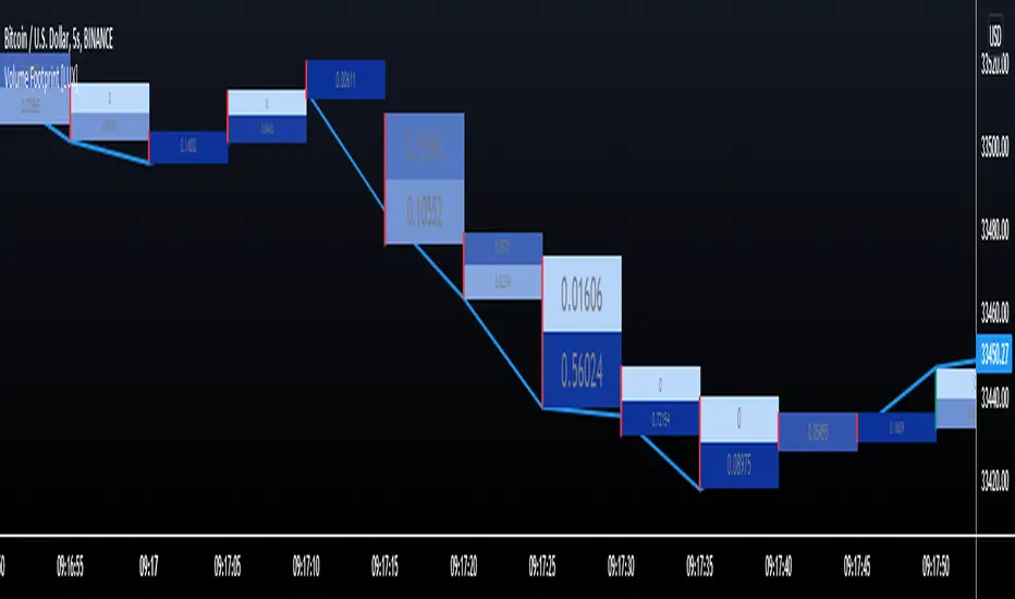
Volume Footprint [LuxAlgo]This indicator estimates a volume footprint using tick data. The script automatically separates a candle into equidistant intervals with a width obtained from the average true range or a user-given width.
Settings
Method: Interval width calculation method. This ultimately determines the number of intervals separating one candle.
Width (At the right of Method): Atr period or user given width depending on the selected method. A lower user-given width would divide a candle into a higher number of intervals.
As Percent: Returns the accumulated volume within each interval as a percentage of the total candle volume.
Style
Display Type: Determines the appearance of the returned volume footprint.
Trend Color: Color to use based on whether a candle is bullish or bearish.
Usage
When applied to a chart, the user will be asked to select the settings to use for the volume footprint. Note that changing the settings afterward will reset the volume footprint, removing previously generated footprints.
A new footprint will appear on the confirmation of a new bar, as such this version might only be useful in lower timeframes.
A volume footprint allows users to see the number of contracts exchanged within a candle interval. It can as such be seen as some kind of intrabar volume profile.
This can be useful to see areas of interest within a candle.
Different Appearance
By default, the volume footprint makes use of colored boxes with a color based on whether the candle was bullish or bearish.
Another appearance that gives additional information is the gradient type, which uses intervals color based on the number of contracts exchanged within an interval relative to the total volume of the candle. A higher number of contracts within an interval would return a darker color by default.
The regular display type makes use of boxes with a single color, with lines on the side indicating whether the candle was bullish or bearish.
Volume+ (RVOL By Time of Day)This script is an enhanced volume indicator.
It calculates relative volume (RVOL) based on the average volume at that time of day (rather than using a moving average).
For example, using this indicator you can see today’s volume during the first 5-minute candle of the market open compared to the previous day’s volume at the market open. Or you can see today’s volume at the market close during the last 15-minute candle compared to the average of the past 20 days of volume at the market close.
Due to the different quantity of candlesticks in a session between Stocks and Forex/Crypto, I separated those markets into separate settings, making this an all-in-one volume indicator that works on all markets.
Settings:
Stocks
If you set the lookback period to 1 on the 5-minute chart and look at the 9:30am candle for a stock, then the current volume bar will show you what today’s volume is compared to yesterday’s 9:30am 5-minute candle.
If you set the lookback period to 15, then the current volume bar will show you what today’s volume is compared to the average of the last 15 days of 9:30am 5-minute candles.
Max Lookback: 64 Sessions
Stocks
This setting is for traders who want to use this indicator on a timeframe lower than the 5-minute chart.
Due to limitations in how many historical bars PineScript can reference, referencing 1-minute and 3-minute bars requires a lot more historical data so I separated the two to allow the 5-minute+ timeframes to have a longer lookback period.
Max Lookback: 12 Sessions
Forex/Crypto
When you set the script to Forex/Crypto, it does the same thing for stocks but calculates based on a 24-hour period.
So if you set the lookback period to 1 on the 1-hour chart and look at the 11:00am candle for a currency pair, then the current volume bar will show you what today’s volume is compared to yesterday’s 11:00am 1-hour candle.
If you set the lookback period to 10, then the current volume bar will show you what today’s volume is compared to the average of the last 10 days of 11:00am 1-hour candles.
Max Lookback: 17 Sessions
What Doesn’t It Work On?
Because I had to manually calculate how many volume candles to look back per timeframe to get the previous session’s candle, I had to hard-code the math in this script.
That means that this indicator will only work on 1m, 3m, 5m, 15m, 30m, 45m, 1h, 2h, 3h, 4h, Daily and Weekly timeframes. If you try to use it on any other timeframe it will revert to a regular volume indicator.
Why Is It Useful?
Similar to volume profile by price, this gives you a volume profile by time in a way that the default volume indicator does not.
For example, you can use this to determine when a stock has a particularly strong opening drive, or when a currency pair has a weak fake-out leading up to the London open, or for general confirmation on trading signals with time-specific volume information to work with.
Colors
The purple line and the faint gray bar is the RVOL value.
The blue number is the percentage of the current volume bar relative to RVOL.
There are four different bar color settings:
Heatmap – Changes color to be brighter based on higher RVOL
Price – Changes color based on price action (like the default TradingView volume indicator)
Traffic – Changes color based on RVOL percentages (for fast visual cues)
Trigger – Changes color only when the specified alert conditions are met
Heatmap:
Traffic:
Trigger:
Price:
Heatmap:
Turns very bright green at 2.0 RVOL
Turns light green at 1.0 RVOL
Turns normal green at 0.75 RVOL
Turns medium green at 0.5 RVOL
Turns very dark green at 0.25 RVOL
Is gray otherwise.
Price:
Turns red if the price action candle closed bearish.
Turns green if the price action candle closed bullish.
Traffic:
Turns red if RVOL is between 1.0 and 1.5.
Turns orange if RVOL is between 1.5 and 2.0.
Turns dark green if RVOL is between 2.0 and 3.0.
Turns bright green if RVOL is above 3.0.
Is gray otherwise.
Trigger:
Turns teal if any of the given alert conditions in the user settings are met.
Alerts
Alerts are optional. You have to set them like any other indicator, by creating a new alert and selecting this indicator.
If you leave the "Alert At RVOL %" setting at 0, then alerts will only be triggered if the current candle exceeds the 1.0 (100%) RVOL level.
If you change the "Alert At RVOL %" setting then alerts will be triggered if the RVOL percentage (blue number) exceeds your given value. The blue number is a percentage of the average, so if it’s at 0.5, then it’s 50% of the average.
Notes
- This indicator only works with regular time bars. It will not work with range, tick, renko etc.
- This script has lookback limitations due to restrictions on how many historical bars PineScript can reference. The lookback limit varies based on the market type you choose. The more bars required for calculation the lower the lookback limit.
- If you use it on the Daily timeframe the lookback period will count as 1 week. If you use it on the Weekly timeframe the lookback period will count as 1 month. So a Lookback of 3 on the Daily would be 3 weeks of averages, a Lookback of 5 on the Weekly would be 5 months of averages (for that Day of Week or Week number).
- Big thanks to @tb12345 for the idea and for helping to field-testing the indicator!

Relative Volume - VPA / VSA / Better VolumeVolume is important.
Volume is VERY important.
But all the existing methods of volume analysis and order flow analysis fall into the same trap: they're all extremely complicated, hard to learn, and difficult for the human brain to distill down to an actual, tradable signal.
The Relative Volume Gradient Paintbars indicator seeks to address this issue by reducing and simplifying concepts from Volume Price Analaysis (VPA), Volume Spread Analysis (VSA), and Market Profile / Volume Profile into a single indication with varying levels of intensity. Rather than adding more complex symbology and cluttering up your charts with arrows and signals and lines as many volume indicators do, relative volume intuitively takes advantage of the dimension of color, and plays to your brain's automatic recognition of color intensity to highlight areas of interest on a chart where large volumes are being traded. These areas can in turn point out levels of support and resistance, or show strength in a move, exposing the actions of larger market participants that are behind a move.
The Relative Volume indicator can calculate based on a time-segmented / time-based / bar-specific average of volume, adjusting for some of the typical spikes in volume that happen at the beginning and end of a trading day; Or it can be calculated based on any length and type of moving average of volume that is desired: simple, exponential, weighted, Wilders, price-weighted, Hull, or TEMA.
This indicator does more than just normal relative share volume. It can also do relative volume-per-range. The idea behind this setting is that when more volume is being traded but very little movement is happening, this can indicate substantial support or resistance, where a lot of trades are likely being absorbed by larger operators. You can choose your own range calculation for this setting, whether you prefer True Range, high-low range, candle body range, close to close range, or any of several other custom settings.
Moreover, the levels or thresholds at which the color intensity changes are completely user-controlled, so you can adjust them upward to tune out more noise, or downward to increase the level of sensitivity. In addition, all of the colors for each of the thresholds are completely user-controlled.
We hope to see TradingView add support for Richard Arms' CandleVolume or Equivolume before too long, as well as Tick Volume or Trade Count Volume data, all of which can add a lot of power to this method of trading.
GB Matrix Pro + [AUTO] |Algo Matrix|Description:
█ OVERVIEW
The GB Matrix Pro + is the definitive "Power of 3" (PO3) pricing engine from the Algo Matrix suite. It solves the biggest challenge in algorithmic grid trading: "Which grid size should I use?"
Powered by a proprietary Hybrid Statistical Engine, this indicator continuously analyzes Market Structure, Average True Range (ATR), and Volume profiles to automatically calculate and project the mathematically correct dealing range (e.g., 27, 81, 243, 729) for any asset and timeframe.
█ KEY FEATURES
Auto-PO3 Hybrid Engine : No more manual guessing. The script offers three calculation modes: Hybrid (Recommended): Combines Timeframe constraints with Statistical Volatility to find the perfect grid size. Stat Volatility: Purely dynamic, expanding and contracting the grid based on market energy (ATR/Volume). Timeframe: Hardcoded institutional mappings (e.g., 15m = 81, 4H = 243).
The Matrix Grid (GB & Twin Tower) : Projects the institutional "Playing Field" with full IPDA (Interbank Price Delivery Algorithm) labeling. GB Standard: The classic quadrant/octant division. Twin Tower (TT): A specialized node system (0.14 / 0.86) for high-frequency reversal setups. Enigma Zones (OFG): A specific "Order Flow Grid" overlay that highlights high-probability magnetic zones.
Smart Swing Detection (Magnet Logic) : The script doesn't just guess the swing; it verifies it. HTF Magnet: Scans higher timeframes to find the true "Origin" of the move. CISD Verification: Visualizes the "Change In State of Delivery" to confirm if a swing is valid for trading.
B1 Bands & Clusters : A visual projection system that highlights where multiple algorithmic levels converge. Origin Cluster (Gold): The grid surrounding the anchor swing. Nearby Cluster (Teal): A dynamic projection that appears when price taps a specific algorithmic sensitivity point. History Mode: Visualizes past clusters to allow for backtesting of the logic.
Smart SNR (Inversion) : An automated Support & Resistance engine that understands breaks. If a strong resistance level is broken by a candle body, it automatically "Inverts" color and logic to become Support.
█ HOW TO USE
Setup : Apply the indicator and ensure "Auto-PO3" is enabled (Default). The script will instantly frame the current price action within the correct mathematical bounds.
The Grid Trade : Watch for reactions at the 0.0 (Low), 0.5 (EQ), and 1.0 (High) levels. These are the primary decision points for institutional algorithms.
Cluster Confluence : Enable Show Bands (B1) . When price enters a "Cluster" (a shaded zone where Grid and Swing projections overlap), look for a reversal signature (CISD or MSS) to take the trade.
Trend Continuation : Use the Smart SNR lines. If price breaks a Red (Resistance) line and it flips to Green (Support), treat the retest of that line as a high-probability entry.
█ DISCLAIMER Trading financial markets involves high risk. This tool is a technical analysis aid for educational purposes and does not constitute financial advice.
By |Algo Matrix|

OCTOPUS-Advanced Market Scanner [v24.6]OCTOPUS — Advanced Crypto Market Scanner
Overview
OCTOPUS is a professional-grade multi-asset momentum and relative strength scanner specifically engineered for the high-velocity Cryptocurrency Market. By scanning 15 of the most liquid crypto assets simultaneously, it identifies institutional participation, capital rotation, and high-probability breakout setups in real-time. Unlike standard lagging indicators, OCTOPUS utilizes a multi-layered evaluation system to rank coins based on volume surges, alpha generation (RS), and localized volatility contraction.
Core Logic & Scoring Engine
The indicator processes real-time data through a sophisticated evaluation framework (Core Engine v7), assigning a "Score" (0–5) to each asset. This comprehensive scoring engine evaluates the crypto market through four primary lenses:
Volume Velocity: Compares current volume against a 20-period SMA. It captures the "Institutional Footprint" when volume significantly exceeds the user-defined Volume Multiplier.
Impulse Sensitivity: Monitors price change percentage. It filters out market noise and highlights assets entering a "State of Trend."
Relative Strength (RS Δ): Essential for crypto trading, this calculates the "Alpha" of each coin by comparing its performance against a Macro Proxy (e.g., BTC, HBAR, or a Custom Ticker). This highlights which altcoins are leading the market during Bitcoin's movements.
Institutional Pockets: A volatility-contraction algorithm that identifies "coiling" phases where the price range narrows significantly despite high volume profile. These zones are critical for identifying "Spring" or "Shakeout" maneuvers before explosive moves.
Key Features
Dynamic Horizontal HUD: A real-time, auto-sorting dashboard located at the bottom of the interface. The scanner utilizes a sorting algorithm that prioritizes assets with the highest institutional scoring, automatically placing market leaders at the beginning of the list (left-most columns) for immediate identification.
Macro Proxy Benchmark: Allows users to select a market benchmark (BTC, HBAR, etc.). This ensures RS calculations remain accurate during different market regimes (e.g., Altseason vs. Bitcoin Dominance).
Advanced State Classification:
L-LEAD / S-LEAD: Peak momentum with heavy volume confirmation (Top 1% of moves).
IMPULSE UP/DOWN: Strong directional trend currently active.
READY ZONE: Asset is in a "Pocket" (volatility contraction), indicating a potential breakout is imminent.
Optimized Alerts: Integrated alert logic triggered only on confirmed bar closes for assets reaching the highest confidence score (Score 5).
How to Use
Asset Selection: Focus on assets appearing on the left side of the HUD. These are your market leaders with the highest scoring (4–5).
Anticipation: Monitor the "READY ZONE" status to identify coins that are consolidating and accumulating strength before a major expansion.
Refinement: Adjust Impulse Sensitivity based on market conditions (lower for Scalping, higher for Swing trading on 4H/Daily timeframes).
Technical Transparency & Performance
This script is engineered for peak efficiency and strictly adheres to the TradingView No-Repaint policy. All request.security calls are executed with lookahead = barmerge.lookahead_off. The scanner is carefully optimized to stay within platform limits while providing comprehensive coverage of the crypto universe.
Disclaimer: This tool is for educational and analytical purposes only. Trading cryptocurrencies involves significant risk, and past performance is not indicative of future results.

VIP ALERTS - KeyLevels SuiteThe Key Levels + Volume Profile + Supply/Demand Zone + MA Suite + Buy/Sell Alert indicator (often seen in advanced TradingView setups or custom "all-in-one" professional suites) is a powerful confluence-based trading tool designed for price action, institutional/Smart Money, and confluence traders.
It brings together five of the most respected technical analysis concepts into one unified dashboard, helping traders identify high-probability zones and receive objective entry/exit signals.
Core Components of the Indicator
Volume Profile (The Foundation of Value & Liquidity)
Displays horizontal histogram showing volume traded at each price level
Highlights critical levels:
POC (Point of Control) → price with maximum traded volume
VAH / VAL (Value Area High/Low) → ~70% of volume zone
HVN (High Volume Nodes) → strong acceptance/support/resistance
LVN (Low Volume Nodes) → potential breakout/acceleration zones
Acts as the "truth layer" — price tends to respect or react strongly when it meets significant volume history.
Supply & Demand Zones (Institutional Order Blocks / Liquidity Pools)
Automatically detects and draws fresh/untested zones where aggressive buying (Demand) or selling (Supply) previously occurred
Usually color-coded:
Green/Blue zones → Demand (potential buying interest)
Red/Purple zones → Supply (potential selling pressure)
Many versions include mitigation/partial fill logic + aging (fading strength of old zones)
MA Suite (Multi-Timeframe Moving Averages)
Collection of dynamic trend filters & dynamic S/R:
Common combinations: 9/21/50/200 EMA • 20/50/100/200 SMA • VWAP
Often includes EMA clouds, ribbon, or trend coloring

VP + VWAP Signal System PRO Gold / Gold Futures VP + VWAP Signal System PRO (GOLD ONLY)
⚠️ IMPORTANT — READ BEFORE USE
This indicator is designed EXCLUSIVELY for Gold (XAUUSD / Gold Futures).
It is NOT intended for stocks, crypto, indices, or other forex pairs.
Gold has unique intraday behaviour:
VWAP-dominant trend continuation
Delayed value migration
Frequent displacement from previous-day value
This script is purpose-built specifically for those conditions.
⚠️ CRITICAL REQUIREMENT — MANUAL PD LEVELS (MANDATORY)
This indicator DOES NOT auto-calculate:
Previous Day POC
Previous Day VAH
Previous Day VAL
You MUST:
Add Trading View’s Session Volume Profile (SVP) indicator
Use Trading View SVP values ONLY:
PD-POC
PD-VAH
PD-VAL
Manually enter these values EVERY DAY into:
PD POC (from SVP)
PD VAH (from SVP)
PD VAL (from SVP)
Why this is mandatory:
Trading View SVP uses tick volume
Third-party PD values will differ
Auto-calculated PD levels will not match Trading View
Incorrect or outdated PD levels WILL produce incorrect buy/sell signals
📌 If you do not update PD levels daily, signals are INVALID.
This is intentional and by design.
HOW THE SYSTEM WORKS (HIGH-LEVEL)
This is a context-aware execution system, not a signal spam indicator.
It combines:
Previous Day Value (PD-POC / PD-VAH / PD-VAL)
Session VWAP + deviation bands
Higher-timeframe VWAP bias
Volume confirmation
ATR impulse validation
Time-based & session-based filters
Signals are generated only when context AND execution align.
BUY & SELL BIAS — WHY IT EXISTS
Base Bias (Value-Based)
Buy bias when price is above PD-POC
Sell bias when price is below PD-POC
This reflects auction theory and value acceptance.
GOLD-SPECIFIC BIAS OVERRIDES (CRITICAL)
Gold frequently trends far away from PD levels, especially on trend days.
Without overrides, valid Gold trades would be blocked.
✅ Gold Buy Bias
Buy signals are allowed when:
VWAP slope is up
Price is above VWAP
Higher-timeframe VWAP bias is bullish
➡️ Even if PD-POC is below price
✅ Gold Sell Bias
Sell signals are allowed when:
VWAP slope is down
Price is below VWAP
Higher-timeframe VWAP bias is bearish
➡️ Even if PD-POC / VAH / VAL are far below price
📌 This logic is intentional, required, and correct for Gold.
SIGNAL TYPES
BUY SIGNALS
PD-VAL rejections (range / rotation days)
VWAP pullback continuation (trend days)
VWAP lower band deep pullbacks
SELL SIGNALS
VWAP pullback continuation (trend days)
PD-VAH rejection (range / rotation days)
VWAP upper band rejection
ALL signals require:
ATR-based impulse strength
Volume confirmation
Acceptance / rejection validation
Cooldown protection
Optional 5-minute confirmation for 1-minute charts
WHO THIS INDICATOR IS FOR
✔ Traders who understand VWAP & Volume Profile
✔ Traders willing to manually update PD levels daily
✔ Traders focused on Gold only
✔ Traders who value quality over quantity
❌ Not for beginners
❌ Not plug-and-play
❌ Not universal across markets
DISCLAIMER
This indicator is a decision-support tool, not financial advice.
Past performance does not guarantee future results.
Always use proper risk management.
BEST SETTINGS
(RECOMMENDED CONFIGURATION — GOLD)
These settings are optimized specifically for Gold based on real execution behaviour, not curve-fitted backrests.
🔹 Signal Settings
✅ Enable ALL PD & VWAP signals
Enable PD-VAL
Enable PD-VAH
Enable VWAP Main
Enable VWAP Upper
Enable VWAP Lower
❌ Require Strong Close → OFF
❌ Lock to Execution Timeframes Only → OFF
✅ Enable Alerts → ON
🔹 Higher Timeframe & Execution Logic
❌ Require HTF Bias Confirmation → OFF
(Enabling this causes late signals)
✅ Require 5-minute confirmation for 1-minute signals → ON
📌 Personal recommendation:
3-minute chart is ideal
1-minute is often too early
5-minute can be late
🔹 Acceptance / Rejection Filter
✅ Require Price Acceptance → ON
Acceptance Reference:
VWAP Main (recommended)
🔹 Session Filter
❌ Session Filter → OFF
Use only if you want to trade a specific session.
Personally recommended to keep all sessions enabled.
🔹 Distance & Volatility Filters
❌ Require Minimum Distance from POC → OFF
❌ Use ATR-Based Distance → OFF
.
🔹 Volume & Cooldown Protection
✅ Use Volume Filter → ON
✅ Enable Signal Cooldown → ON
✅ Block Signals During POC Chop → ON
🔹 Day Type & Trend Filters
❌ Enable Day Type Filter → OFF
❌ Trade Trend Days Only → OFF
Gold trend behavior is already handled via VWAP slope & bias logic.
🔹 ATR Impulse Filter (VERY IMPORTANT)
✅ Enable ATR Impulse Filter
ATR Multiplier: 0.3
This prevents entries on weak candles that retrace immediately.
📌 HOW TO TRADE THE SIGNALS (IMPORTANT)
This indicator does not replace trade management.
Always:
Watch Main VWAP reaction
Observe price behaviour at VWAP & PD levels
Trade Management (Strongly Recommended)
Stop-loss: Logical structure invalidation
TP1:
Previous High (BUY)
Previous Low (SELL)
When TP1 is hit:
Take partial profits
Move stop-loss to break-even
Then:
Let runners continue OR
Close the full position safely
This approach maximizes R-multiple while protecting capital.
⚠️ FINAL NOTES
This is a precision execution tool, not a signal spam indicator
Signals are intentionally filtered
Fewer signals = higher quality
Manual PD levels must be updated daily (see main disclaimer)

Cross-Exchange VWAP with VAH/VALThis indicator calculates a cross‑exchange VWAP by aggregating price and volume data from up to four major crypto exchanges: Coinbase, Binance, Bybit, and OKX.
It also derives Value Area High (VAH) and Value Area Low (VAL) using a volume‑weighted standard deviation around VWAP.
What this indicator does
Aggregates price × volume and volume from multiple exchanges for the same asset
Calculates a single, unified VWAP reflecting broader market activity rather than a single venue
Computes VAH and VAL as:
VAH = VWAP + k × σ
VAL = VWAP − k × σ
where σ is the volume‑weighted standard deviation and k is user‑configurable
Exchanges supported
Coinbase (default quote: USD)
Binance (default quote: USDT)
Bybit (default quote: USDT)
OKX (default quote: USDT)
Each exchange can be enabled/disabled individually, and symbol overrides are supported (e.g. BTCUSDT, BTCUSDT.P, ETHUSD).
VWAP anchoring options
You can choose how VWAP and Value Area reset:
Daily (UTC session)
Weekly
Monthly
None (fully cumulative)
Manual reset via input toggle
This makes it suitable for intraday, swing, and higher‑timeframe analysis.
Value Area configuration
Standard deviation multiplier (k) is configurable
k = 1.0 → ~68% band (default)
k ≈ 1.036 → ~70% band (normal assumption)
Optional shaded VAL–VAH area for quick visual context
Note: VAH/VAL are derived from VWAP ± σ, not from a full volume‑profile histogram.
This approach is computationally efficient and stable for real‑time trading.
Optional status table
An optional table (top‑right) displays:
Enabled exchanges
Active trading pairs per exchange
Volume availability status
Useful for quickly validating data coverage.
Intended use cases
Institutional‑style VWAP analysis across venues
Reducing single‑exchange bias in crypto trading
Identifying fair value, mean reversion zones, and acceptance areas
Intraday execution and swing trade context
Notes & limitations
Availability of symbols may vary by exchange
(use symbol overrides if needed)
Crypto sessions are UTC‑based for daily resets
Not a true Market Profile / volume‑at‑price VA calculation

Index Quant Master: Volatility & Structure [Auto-Adaptive]This indicator is a comprehensive institutional-grade toolkit designed for high-precision intraday trading across major US Indices (SPX, NDX, RUT). It synthesizes Option Market Volatility, Auction Market Theory, and Algorithmic Structures into a clean, clutter-free overlay.
Designed for professional traders, this suite features a Universal Auto-Router that adapts its logic to the asset you are trading.
## Key Features & Logic:
1. Dynamic Implied Volatility Mapping (Auto-Router)
* Instead of static technicals, this module calculates statistical expected moves based on Dealer Gamma Exposure.
* Auto-Adaptive: Automatically detects the underlying asset and maps it to the correct Volatility Index:
* SPX / ES / SPY $\rightarrow$ VIX / VIX1D
* NDX / NQ / QQQ $\rightarrow$ VXN
* RUT / IWM $\rightarrow$ RVX
* Significance: These levels represent the 1-standard-deviation daily expected range.
2. Auction Market Structure (Smart Volume Profile)
* Exclusive Optimization: The Volume Profile engine is strictly optimized for major indices (SPX, NDX, ES, NQ) to ensure high-fidelity calculation of POC and Value Areas.
* Auto-Disable: To maintain performance, VP logic is automatically disabled on ETFs (SPY, QQQ) or lower-volume tickers.
* HVN/LVN: Identifies High Volume Nodes (Magnets) and Low Volume Nodes (Acceleration Zones).
3. Algorithmic Retracements & Pivots
* Plots standard Daily/Weekly Pivots and Fibonacci retracements derived from the prior session's volatility range.
* These levels serve as "Schelling Points" (consensus zones) for HFT algorithms.
4. Smart Visualization Engine
* Proximity Activation: Levels remain hidden to reduce cognitive load, only appearing when price approaches the zone (Watermark Logic).
* Adaptive Label Merging: To prevent visual clutter, overlapping levels automatically merge into a single cluster based on a dynamic percentage threshold ($0.05\%$), ensuring readability across different price scales (e.g., SPX vs. QQQ).
Usage:This tool is the ultimate overlay for S&P 500, Nasdaq 100, and Russell 2000 traders who rely on data-driven structural levels rather than lagging indicators.

AMT VWAP [hardi]█ OVERVIEW
AMT VWAP is a clean, minimalist VWAP indicator with Standard Deviation bands, designed to complement the Auction Market Theory (AMT) trading methodology by Fabio Valentino.
This indicator focuses on one thing and does it well: displaying VWAP and its deviation bands clearly on your chart.
█ FEATURES
- Daily VWAP with automatic reset
- ±1 Standard Deviation bands (cyan)
- ±2 Standard Deviation bands (orange) - extreme zones
- Clean labels that don't clutter your chart
- Info table showing current bias and zone
- Compact Mode for mobile/smartphone users
- Fully customizable colors and settings
- Built-in alerts for all levels
█ HOW TO USE
VWAP (Volume Weighted Average Price) represents the "fair value" where most volume has transacted. In AMT methodology:
BIAS DETERMINATION:
- Price ABOVE VWAP = Bullish bias (buyers in control)
- Price BELOW VWAP = Bearish bias (sellers in control)
TRADING ZONES:
- ±1 SD: Normal deviation zone - potential mean reversion area
- ±2 SD: Extreme zone - high probability reversal area (95%+ reversion rate)
ENTRY STRATEGIES:
1. Trend Following: Buy pullbacks to VWAP in uptrend, sell rallies to VWAP in downtrend
2. Mean Reversion: Fade moves at ±2 SD bands with confirmation
█ RECOMMENDED SETUP
Use this indicator together with:
- TradingView's built-in "SVP HD" (Session Volume Profile) for POC/VAH/VAL levels
- AMT CVD indicator (companion indicator) for order flow analysis
This combination gives you the complete AMT toolkit:
- SVP HD → Key levels (POC, VAH, VAL)
- AMT VWAP → Dynamic support/resistance & bias
- AMT CVD → Aggression, Absorption, Exhaustion signals
█ SETTINGS
Display Settings:
- Compact Mode - Enable for cleaner mobile view
- Show Labels - Toggle level labels
- Label Size - Adjust for your screen
VWAP Settings:
- Band Multipliers - Adjust SD band distance (default: 1.0 and 2.0)
- Colors - Fully customizable
- Line widths - Adjust visibility
Alerts:
- Near VWAP
- Near ±1 SD
- Near ±2 SD (extreme zones)
█ METHODOLOGY
This indicator is based on Auction Market Theory as taught by Fabio Valentino:
"The market is a continuous auction seeking fair value. VWAP represents this fair value dynamically throughout the session. Deviations from VWAP create trading opportunities as price tends to revert to the mean."
Key principles:
- Read, don't predict
- Location over technique
- Evidence-based entries
█ ALERTS
Set alerts for:
- Price approaching VWAP (potential support/resistance)
- Price at ±1 SD (first deviation - watch for reaction)
- Price at ±2 SD (extreme - high probability reversal zone)
█ NOTES
- Works on all timeframes
- Best used on 15m for intraday entries
- VWAP resets daily at market open
- Combine with volume profile for best results
█ CREDITS
Based on Auction Market Theory methodology by Fabio Valentino.
Indicator developed for the trading community.
If you find this useful, please leave a like! 👍
vwap, volume-weighted-average-price, standard-deviation, bands, auction-market-theory, amt, fabio-valentino, mean-reversion, trend-following, intraday, day-trading, support-resistance, fair-value

Adaptive Gaussian AFR# Adaptive Gaussian AFR (Average Filtering Range)
The **Adaptive Gaussian AFR** is a sophisticated trend-following overlay designed to provide a "cleaner" perspective on market structure. It synthesizes advanced signal processing with volatility-adjusted trailing logic to create a perpetual trend indicator that filters noise while maintaining extreme responsiveness during momentum breakouts.
## How It Works
This indicator combines three distinct mathematical principles to analyze and visualize price action:
### 1. 4-Pole Gaussian Smoothing
Standard moving averages often suffer from a trade-off between smoothness and lag. By employing a **4-pole Gaussian filter**, the indicator applies a bell-curve weighting to price data. This results in a curve that is mathematically smoother than an EMA but reacts more sharply to significant price shocks.
### 2. Adaptive Volatility Scaling
Unlike static indicators, this script utilizes a **Volatility Ratio** (comparing short-term ATR to long-term ATR).
- **Expansion:** When volatility spikes, the Gaussian filter automatically shortens its lookback to "catch" the breakout.
- **Contraction:** When the market consolidates, it lengthens the lookback to prevent "whipsaws" and false signals.
### 3. AFR (Average Filtering Range) Logic
The "step-ladder" behavior is driven by the AFR logic. It calculates volatility-based boundaries (using an ATR factor). The trend line only moves higher if the price exceeds the current floor, and only moves lower if the price breaks the ceiling, creating a "perpetual" support and resistance level.
## Visual Interface & Branding
The script features a high-visibility sentiment map using a custom brand color scheme:
- **Bullish State (Blue - rgb(45, 162, 252)):** Triggered when price is trading above the Adaptive Gaussian mean and the AFR floor.
- **Bearish State (Purple - rgb(113, 59, 249)):** Triggered when price breaks below the mean and the AFR ceiling.
- **Brand Candles:** Price bars are automatically colored to match the trend state for immediate visual confirmation.
## Why This is Unique
Most trend followers are "fixed"—they perform well in trending markets but fail in sideways chop. The uniqueness of the **Adaptive Gaussian AFR** lies in its ability to "breathe." Because the Gaussian engine is adaptive, it attempts to solve the "lag vs. noise" problem by becoming more rigid when the market is indecisive and more fluid when a trend is confirmed.
## Great inventions require great Care
**This is not a standalone trading system.** While the Adaptive Gaussian AFR provides a highly refined view of the trend, it should be used in conjunction with other analysis tools.
- **Lag:** Like all indicators based on historical data, the filter is inherently lagging and cannot predict future price movements.
- **No Standalone Use:** Do not use this as your sole reason for entering or exiting a trade. It is best used as a **Trend Filter** or a **Volatility-Adjusted Entry/Exit Strategy in confluence with other tools**.
- **Context Matters:** It does not account for fundamental news, higher-timeframe resistance, or volume profiles.
Enjoy!

Futures Psychological Levels PROFutures Psychological Levels PRO – Professional Usage Guide
Indicator Overview
This elite psychological levels tool dynamically plots the most institutionally relevant round-number clusters across futures markets (ES, NQ, YM, CL, GC, SI, BTC, and custom instruments). It separates levels into three hierarchical tiers — Major, Tradable, and Sniper — while intelligently filtering distant levels using an ATR-based proximity engine. The result is a clean, adaptive overlay that scales perfectly from scalping precision on 1-minute charts to big-picture context on daily/weekly timeframes.
Core Philosophy
Psychological levels are where order flow clusters: stops, limits, and institutional positioning accumulate around round numbers. This indicator turns static round numbers into a dynamic decision framework by:
Prioritizing confluence zones
Reducing clutter in ranging or low-volatility environments
Highlighting only price-relevant levels in real time
Key Features
Instrument Presets – One-click optimized spacing for major futures contracts
Three-Tier Hierarchy – Major (institutional anchors), Tradable (active defense zones), Sniper (precise entry/exit triggers)
ATR Proximity Filter – Automatically hides irrelevant distant levels
Zones or Lines – Visual magnet areas or clean horizontal lines
Price Labels & Summary Table – Instant reference for next major levels above/below
Full Customization – Colors, thickness, styles, and manual overrides
How to Best Use This Indicator (Professional Workflow)
Select the Correct Instrument Preset
Start with the built-in preset matching your chart (e.g., "ES (S&P 500)" for /ES or MES). This instantly applies battle-tested increments. Use "Custom" only for non-standard assets (forex pairs, micros with different tick values, or crypto alts).
Match Settings to Your Trading Style & Timeframe
Reading the Levels – Decision Framework
Major Levels (thick red by default): Highest probability reaction zones. Expect strong reversals, breakouts with volume, or liquidity sweeps. Treat as primary support/resistance.
Tradable Levels (orange): Active trader defense zones. Excellent for limit order placement, partial profit taking, or fading weak moves.
Sniper Levels (thin gray): Precision entries/exits, stop runs, and scalping targets. Confluence with order blocks or volume profile nodes dramatically increases edge.
Trade Setup Examples
Rejection Play: Price approaches a Major level from below → long wick rejection + close back inside → enter in direction of rejection with stop beyond wick extremity.
Break & Retest: Clean breakout through Tradable/Major → retest as new support/resistance → enter on confirmation candle.
Liquidity Sweep: Price briefly breaches Sniper/Major (stop hunt) → rapid reclaim → aggressive counter-trend entry.
Confluence Boost: When a level aligns with daily/weekly open, VWAP, or prior high/low volume node → dramatically increase position size or conviction.
Risk Management Integration
Always place stops just beyond the next logical level (typically a Sniper or Tradable beyond your entry zone). Use the summary table to quickly identify invalidation points. Target the next level in the direction of your bias for minimum 1:2 risk-reward (often 1:3–1:5 achievable at Major levels).
Pro Optimization Tips
High-volatility sessions (NY open, FOMC, NFP): Increase ATR Multiplier slightly to avoid excessive clutter.
Low-volatility Asian/range sessions: Decrease ATR Multiplier for tighter precision.
Combine with Volume Profile (Fixed Range or Session) to confirm high-volume nodes at psych levels.
Pair with anchored/session VWAP for additional confluence layers.
On higher timeframes, disable Sniper levels and zones entirely for minimalist structural analysis.
Important Disclaimer
This indicator is a professional decision-support tool, not a standalone trading system. All trading involves substantial risk of loss. Past performance is not indicative of future results. Always conduct your own analysis, manage risk appropriately, and consider your financial situation before placing trades.
Mastering psychological levels is one of the highest-edge concepts in institutional trading. Used correctly, this indicator gives you the same reference framework that prop desks and market makers watch every day. Trade smart, stay disciplined, and let price action at these levels guide your executions.

Ash_TheTrader: Institutional Truth / Volume ProfileSTOP GUESSING. See the Institutional Truth. (No Repaint)
Most retail traders are trading blind. You are looking at lagging moving averages and "magic" lines that disappear when the price moves against them.
The institutions? They are trading Liquidity.
For months, I have been developing a proprietary engine that strips away the noise and reveals the Statistical Truth of the market. This is not just another "buy/sell" indicator. This is an Institutional Liquidity Engine designed to show you exactly where the money is hiding.
Introducing: Ash_TheTrader: Institutional Truth
👁️ What is "The Truth"?
This script utilizes an Auto-Anchored Liquidity Engine that automatically detects the start of true market cycles. It builds a real-time profile of volume, delta, and imbalance to answer one simple question: Who is actually in control?
It features a "Black Box" Signal Engine that refuses to repaint. If it says BIAS ↑ , the institutional flow is bullish. Period.
🚀 Key Features
• 🚫 NO REPAINT Bias: Signals are mathematically locked. They never disappear. • 🏦 Institutional Logic: It filters out "Retail Traps." If price hasn't reclaimed the Value Level (POC), it won't signal a trade—saving you from buying the top. • ⚡ Dual-Core Engine: Switch between Swing Mode (Macro Trends) and Scalp Mode (M1/M5 Aggressive Algorithms). • 🧱 Liquidity Walls: Bright Neon blocks appear where 75%+ of volume is one-sided. This is where you place your limit orders.
📚 Step-by-Step: How to Trade "The Truth"
1. Choose Your Engine Go to Settings > Algorithm Mode. • Select "Normal (Swing)" for H1/H4 trend trading (Higher Winrate). • Select "Scalp (Aggressive)" for M1/M5/M15 (Faster Signals).
2. The "Green Light" Setup (Long) • Wait for the Dashboard: Look for the signal ✅ SWING BIAS ↑ or ⚡ SCALP BIAS ↑ . • Check the Trap: Ensure the text does NOT say "⚠️ TRAP." • Entry: Enter on the close of the candle. • Stop Loss: Place below the Yellow "Truth" Level (Point of Control) or the recent Swing Low.
3. The "Brick Wall" Scalp • If you see a bright NEON RED block appear on the profile, that is a Bearish Wall . • Price will often bounce off this level aggressively. • Strategy: Place a Sell Limit order at the Neon Red block for a quick reaction trade.
4. The Divergence Warning • Keep an eye on the bottom banner of the dashboard. • If you are Long, but you see a big RED "BEARISH DIV" warning, take profit immediately. The institutions are leaving the trade.
⚠️ A Warning This tool is powerful, but it reveals the reality of the market. Sometimes the Dashboard will say "⚠️ ACCUMULATING" or "⚠️ NEUTRAL." Do not force a trade. The secret to a high winrate is knowing when not to trade. Let the engine do the work.
Add it to your chart now. Stop guessing.
Cheers, @Ash_TheTrader

Session Levels (3of3)This system is designed to strip away market noise and highlight the areas where institutional capital is actually active.
Most retail traders fail because they treat every price movement with equal importance. They often enter trades in the "middle of nowhere" or get trapped by "fakeouts" at standard support/resistance levels.
This tool solves:
Context Blindness: It defines the "playing field" by marking institutional session boundaries (Asia, London, NY), so you know exactly where liquidity resides.
Computation Lag: Standard Volume Profiles often slow down a chart. Our Optimized VPC provides the "Magnet" price without the lag.
Indecision: By requiring a Market Structure Shift (MSS) alongside a Fair Value Gap (FVG), it removes the guesswork of "Is this a reversal or a continuation?"
Why It Is Unique:
Unlike standard indicators that look at a single data point (like just price or just volume), this is a Holistic System.
Auto-Mitigation: Most FVG indicators clutter your screen with old boxes. This tool automatically deletes zones once price "fills" them, keeping your focus on live opportunities.
Institutional "Sweep" Logic: It specifically tracks if price has "stolen" the liquidity from a previous session before issuing a signal.
The "Vegas" Filter: It uses the 144 EMA (Vegas Floor) as a high-probability institutional trend filter, ensuring you aren't fighting the primary trend.
When testing this, track one specific stat: "Did price hit the VPC after the MSS?" You will likely find that even when the trade doesn't reach the far PRZ targets, it reaches the VPC Magnet over 70% of the time. Focusing on that "snap-back" to the orange line is the secret to a high win rate with this tool.

🟡 GOLD 4H HUD v8.9 — Loose ICT OB + Strong/Weak + FVG/HVN/LVNGOLD 4H HUD v8.9 is a clean, structured Smart Money Concepts (SMC)–based analysis tool designed exclusively for XAUUSD on the 4-hour timeframe.
It focuses on the three most important elements for institutional orderflow analysis:
✔ Loose ICT Order Blocks (Demand/Supply)
✔ Fair Value Gaps (FVG)
✔ Volume Profile Zones (HVN/LVN/POC)
The script builds a professional-style HUD that displays the key institutional regions and structural levels that matter most for gold traders.
📌 Key Features
1 — Market Structure Engine (HH/HL & BOS)
The indicator detects:
Minor swing Highs and Lows
Last confirmed HH / HL levels
Break of Structure (BOS) for directional bias
EMA-200 trend filter (UP / DOWN / NEUTRAL)
This gives traders a clean structural read without clutter or noise.
2 — Loose FVG Engine (Tolerance-Based ICT Gaps)
A soft-threshold FVG engine detects “loose” Fair Value Gaps using a 0.1% price tolerance.
This method ensures:
Fewer missed imbalances
Cleaner OB/FVG alignment
Higher accuracy on 4H gold displacement legs
FVGs automatically shift to the right side of the chart for clean visualization.
3 — Order Block Engine (Demand/Supply + Strong/Weak Classification)
A simplified ICT-style OB engine scans the past few candles whenever BOS is detected.
It identifies:
Demand OB during bullish BOS
Supply OB during bearish BOS
Strong OB if fully nested inside an active FVG
Weak OB otherwise
OB boxes include:
Clear color coding (strong vs. weak)
Price range labels inside each box
Automatic right-shift for visual clarity
4 — Volume Profile Engine (POC / HVN / LVN / VAH / VAL)
Based on a rolling window (default 120 bars), the script builds a lightweight volume distribution.
It displays:
POC (Point of Control)
HVN (High Volume Node)
LVN (Low Volume Node)
Value Area High / Low
HVN/LVN zones are shown as right-shifted colored boxes with price labels.
These zones help identify:
Institutional accumulation
Low-liquidity rejection points
Areas where price tends to react strongly
5 — Support / Resistance Mapping
The script automatically generates:
OB-based support/resistance
Swing-high/swing-low levels
HVN/LVN structural levels
These are displayed in the HUD for fast reference.
6 — Professional HUD Panel
A compact, easy-to-read HUD summarizes:
Trend direction
Latest HH/HL
OB ranges (Strong/Weak)
HVN/LVN price zones
POC
Multi-layer support & resistance
This turns the script into a fully functional analysis dashboard.
📌 What This Indicator Is NOT
To avoid misunderstanding:
It does not take entries or generate buy/sell signals
It does not auto-detect CHOCH, MSS, SMT, or sweeps
It is not a trading bot
This tool is designed as an institutional-style map and analysis HUD, not a strategy.
📌 Best Use Case
This indicator is ideal for traders who want to:
Read institutional structure on XAUUSD
Identify clean Demand/Supply zones
Visualize FVG/OB/HVN interactions
Track high-value liquidity levels
Build directional bias on 4H before dropping to execution timeframes
⚠ Important Note
This tool is designed exclusively for the 4H timeframe.
Using it on lower timeframes will display a warning.
